Their Story
For the past 50 years since 1965, Lulu Mosacpol has been a player in the trading and distributing of household and industrial cleaners, and prides itself on being a 100% Singaporean brand. Throughout its years in business, Lulu Mosacpol has expanded its operations into other parts of Asia and diversified its offerings to include higher quality items.
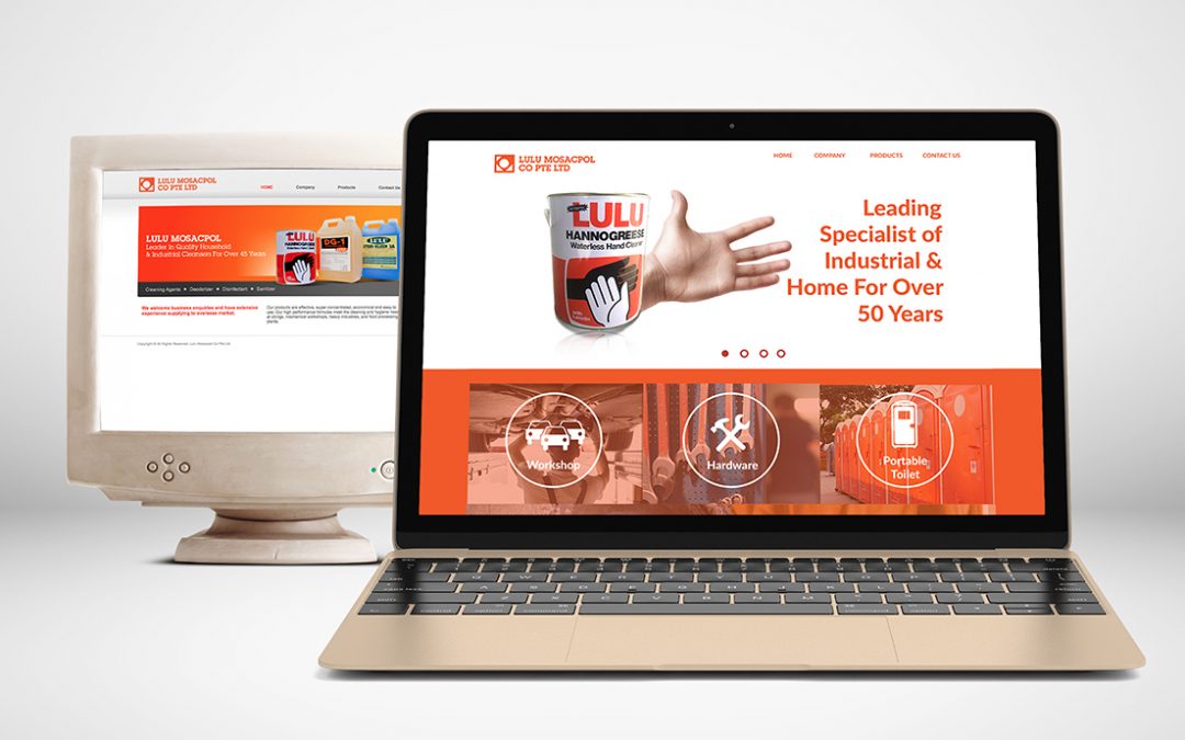
Solution
To capture customers’ attention, we have decided to focus Lulu Mosacpol’s marketing efforts — including its website — around a bold orange colour scheme. With a colour as striking as orange, there will be a better chance of customers making a connection between the colour and Lulu Mosacpol, strengthening its brand identity.
Knowing that a strong SEO is required to make a company’s website a successful marketing tool, we liaised with Lulu Mosacpol and gained more product information which was used to generate more content for the website.
User-experience, when navigating their website, was also an area of improvement. We created a more minimalistic website that was aimed to capture attention by showcasing the benefits of its main products, increasing the chances of lead generation.
Visually, we wanted to maintain a consistent theme for both its online and offline marketing efforts. For its new product brochure collateral, we used the same bold orange and focused on explaining its core products. The reason for this colour consistency was to help Lulu Mosacpol’s future and current customers to immediately relate back to the brand and the solutions they offer.
Challenge
Lulu Mosacpol did not have a distinct brand identity, or a consistent direction for its labels, which was carried over to its dated website. The minimal information presented on the site was also an issue as product information was difficult to find. The combination of these problems led to Lulu Mosacpol’s inability to accurately position its products and itself as the best solution amongst the other brands.
Solution
To capture customers’ attention, we have decided to focus Lulu Mosacpol’s marketing efforts — including its website — around a bold orange colour scheme. With a colour as striking as orange, there will be a better chance of customers making a connection between the colour and Lulu Mosacpol, strengthening its brand identity.
Knowing that a strong SEO is required to make a company’s website a successful marketing tool, we liaised with Lulu Mosacpol and gained more product information which was used to generate more content for the website.
User-experience, when navigating their website, was also an area of improvement. We created a more minimalistic website that was aimed to capture attention by showcasing the benefits of its main products, increasing the chances of lead generation.
Visually, we wanted to maintain a consistent theme for both its online and offline marketing efforts. For its new product brochure collateral, we used the same bold orange and focused on explaining its core products. The reason for this colour consistency was to help Lulu Mosacpol’s future and current customers to immediately relate back to the brand and the solutions they offer.
Results
A vibrant, up to date website that is filled with more product description, case studies and user driven interface that we hope to bring the company with a 20% growth in customers inquiry and sales in the next year.
Visual Expression
We’ve extended the new visual brand of Lulu Mosacpol into a product brochure collateral mainly used to promote the Hannogreese and stri-kleen 3A product. Having the consistency in colours would help current and future customers to relate back to Mr Sim’s Lulu Mosacpol company solutions.